How SupercityOS looks, sounds, and shows up — for everyone who applies the brand, builds with it, or writes in its voice.
Version 1.0Internal · Agency · Engineeringsupercityos.com
01 — Brand story
Big-business support, without the heavy price tag
SupercityOS is a full-service managed IT provider serving small and mid-sized businesses across Atlantic Canada since 1997. We're real people who don't just fix problems—we own them. Every expression of the brand should feel the way our service feels: less stress, fewer surprises, IT that just works.
Managed IT
Help desk and tech support, phone systems, Microsoft 365 & Copilot, cloud management, procurement, networking.
MFA and Zero Trust, password policy, NIST/CIS compliance, cyber-insurance readiness, data governance.
Taglines — verbatim
People Focused. Security Driven.
Secondary: "IT Management, Print Services, and Cybersecurity Defense That Just Works."
Proof points
Trusted by 300+ businesses across Atlantic Canada · In business since 1997 · Apple Technical Partner, Lenovo Gold Partner, Microsoft Partner · Serving legal, construction, non-profit and financial clients.
02 — Logo
The wordmark and the play mark
"SUPERCITY" sets in bright blue, "OS" in deep blue, led by the green play-button mark. The full lockup pairs the wordmark with the slogan; scalable SVGs are the source of truth for on-screen use.
Primary — light backgrounds. Full lockup with slogan.
Primary — dark backgrounds. Dark-alt lockup with slogan.
SVG lockup — UI & web
Mono white — embroidery / single-color only
Favicon & app icon — the play mark alone
Clear space
XX
Keep clear space equal to the height of the play mark (X) on all sides. Nothing enters this zone — no text, rules, or other marks.
Minimum size
Lockup: 140 px / 35 mm wide minimum
Play mark: 24 px / 8 mm minimum
Below these sizes, switch from the lockup to the play mark alone.
Don't
✕Stretch or squash the lockup
✕Recolor any part of the mark
✕Place on photos without a navy scrim
✕Add drop shadows or effects
✕Rotate or tilt the lockup
✕Use white on light — keep contrast
03 — Color
Deep navy, crisp white, one vivid green
Green is the signature — reserved for primary actions and "on/secure" states. Blue carries the brand; purple is a rare accent. Click any swatch to copy its hex.
Super Green
#44D62C
--green
Primary action · success · secure
Brand Blue
#3D95EE
--blue
Links · brand · selected states
Deep Blue
#1D456E
--blue-700
Dark surfaces · headings · text on green
Accent Purple
#A167A5
--purple
Tags · chips · data-viz variety
Ink
#363636
--ink
Primary text — warm near-black
Scales
Usage rules
Green means go: primary CTAs, success, progress, secure states. Never decoration.
On green fills, text is always deep blue #1D456E — never white.
Blue for links, secondary actions, selected states, data accents.
Raleway (600–800) for the wordmark and every headline. Cabin (400–700) for body, UI, and labels. Nunito Sans is wired as the alternate. All three are self-hosted brand fonts.
Raleway — display
People Focused. Security Driven.
Semibold 600Bold 700Extrabold 800
Cabin — body & UI
Enjoy unlimited support from real people who don't just fix problems—they own them. We resolve issues quickly to minimize downtime, so your team can get back to work.
RegularMediumSemiboldBold
Nunito Sans — alternate
Reserved for secondary surfaces where Cabin is unavailable — long-form documents, partner co-branding, spreadsheets. Wired as --font-alt.
The promise is less stress and fewer surprises. Speak to the reader as "you / your business"; we are "we / our team". Outcomes before features. Security is peace of mind, never fear.
Warm & direct
"Let's Take IT Off Your Plate." Short, benefit-led sentences.
Outcome-first
Lead with what the client gets, then how. Concrete results, not feature lists.
Reassuring
Proof over promises: 300+ businesses, named testimonials, partner badges, response times.
Never jargon
No acronym soup, no doom-laden security talk, no overpromising. No emoji in marketing or product UI.
SAY
Get big-business support without the heavy price tag.
Request an AuditGet Your Cyber ScoreBook a ConsultationGet a QuoteDiscover More Client Portal
06 — Photography
Real people, real gear, cool light
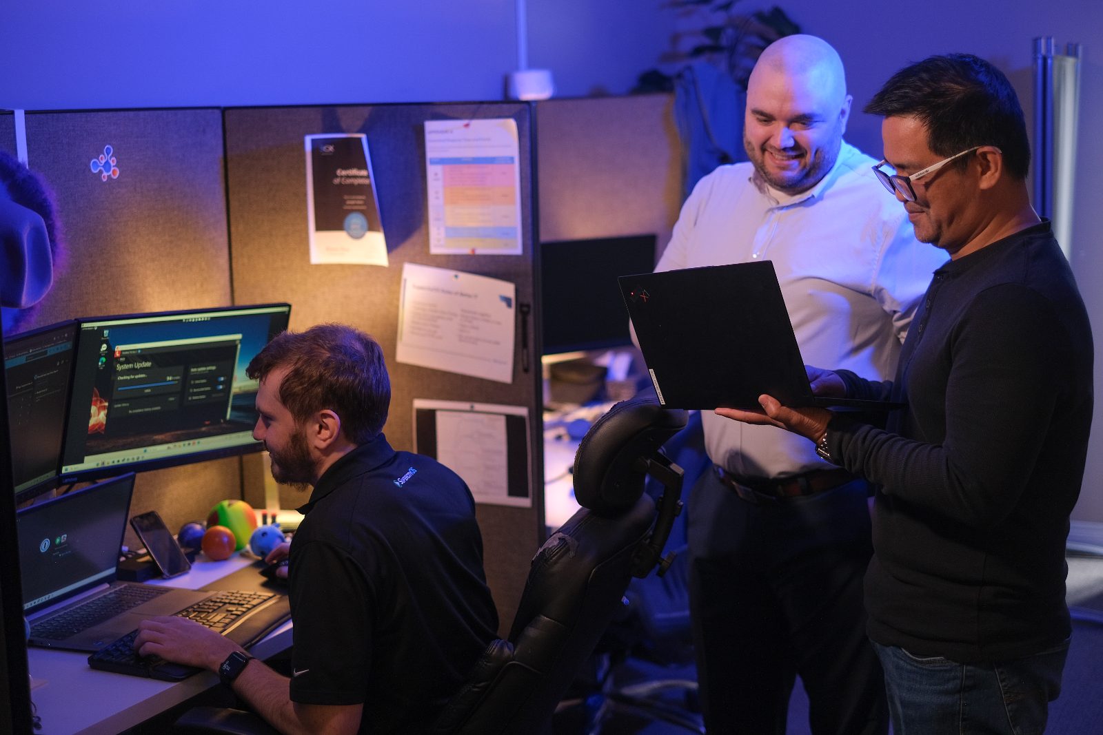
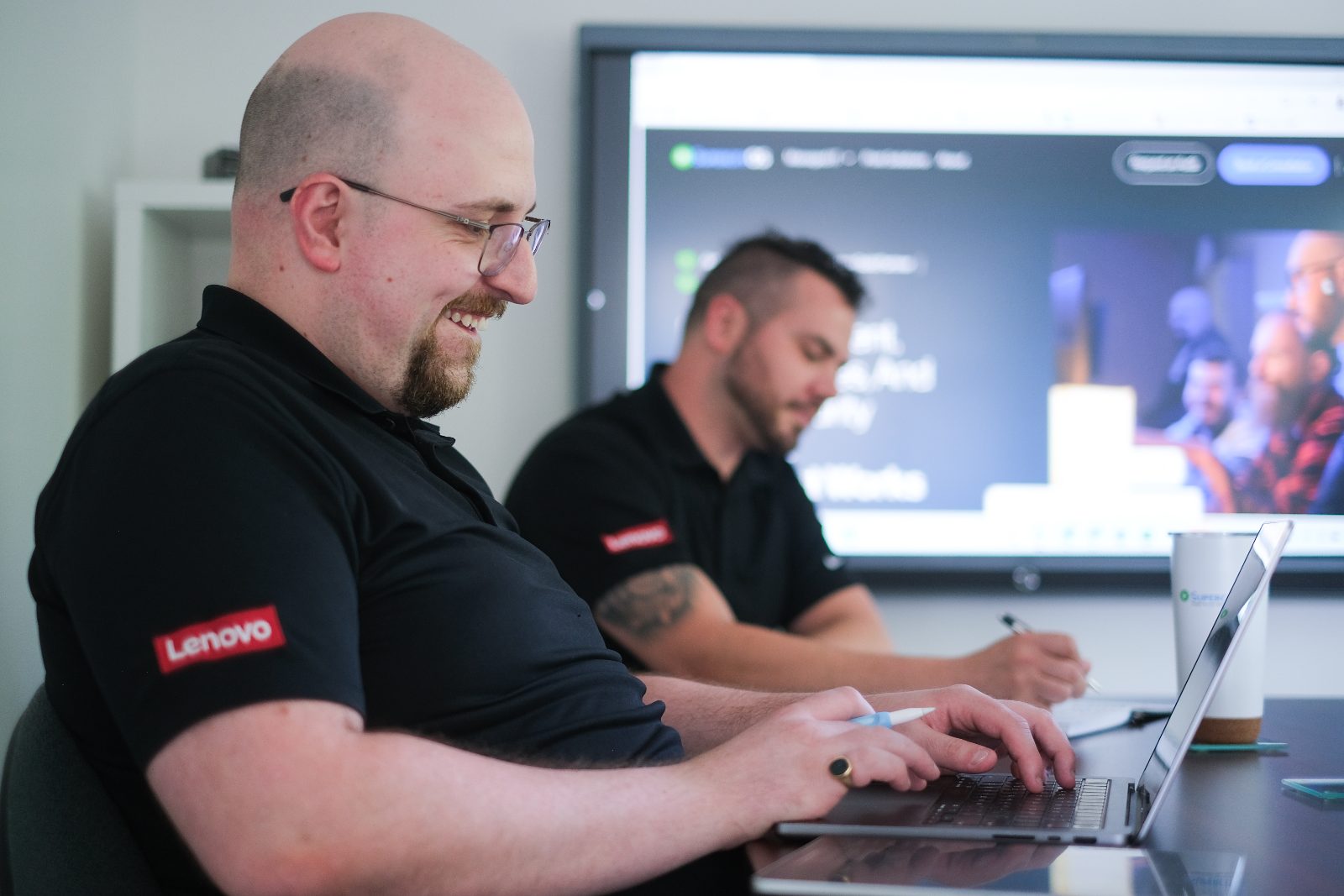
Candid shots of the actual team at work — blue-lit benches, printer bays, help-desk rows. No stock handshakes, no posed grins at the camera. Imagery skews cool; warm candids are welcome when un-overlaid.
Do — standalone imagery runs as-is: honest color, natural grade.
Let's Take IT Off Your Plate
Request an Audit
Do — text on photo always sits on a deep-navy gradient scrim.
Leadership — candid, relaxed, no posing
Hands-on detail — devices in real use
Bench repair — the work up close
Planning — process made visible
Collaboration — techs working together
On-site service — printers and people
Inside the machine — honest detail
Fleet ready to deploy
Portraits — cool, blue-lit, direct
Full library (18 approved shots, web-optimized) lives in assets/photos/.
07 — Iconography
Lucide — outline, 2px, rounded
The system icon set is Lucide: 24px grid, 2px stroke, round caps and joins. Default color is muted gray; blue or deep green for active and accent states. Never emoji, never Unicode glyphs, no filled or duotone icons outside solid color chips.
Default --fg-muted · active --blue-500 or --green-700 · chips pair the icon with its 50-tint background. Partner logos (Microsoft, Apple, Lenovo, Cisco, 3CX, Toshiba, Lexmark) stay in official colors on white — never recolored.
08 — Components
Buttons, inputs, cards, badges
Buttons
Primary is always green with deep-blue text. One primary per view. Secondary is solid blue or a navy outline.
Inputs
12px radius, 1.5px border, blue focus ring (3px, blue-100). Labels are semibold navy, 13px.